— PROJECT NAME
Feature Update for
Google Tasks
— ROLE
User Research
Interaction Design
Visual Design
— TOOLS
Sketch
InVision
Illustrator
Excel
Trello
Google Tasks is a to-do list app by Google that is minimal in functionality and focuses on getting the bare amount done. Unfortunately, its simplicity was leading to low user engagement and low ratings on app stores.
A project while attending General Assembly, my group was tasked with designing a new feature that increases engagement and aligns the app with how people work today. Using the traditional UX design process, our efforts lead to integrating a task-bound timer feature and notifications, helping users actually get everything on their to do lists done.
After receiving the brief, I settled in the roles of User Research, Interaction Designer, and Visual Designer, and set off.

**On Desktop: click to zoom in on images**
DISCOVERY
Researching high and low to get a clear picture on modern productivity habits.
PRELIMINARY RESEARCH
Looking to step away from my own habits and get a feel for how the population-at-large handles productivity, I kicked off my research efforts by hopping online and finding productivity facts and statistics on Lifehacker, LinkedIn, and Psychology Today.
Initial online research on productivity proved eyebrow-raising: studies showed that while 63% of professionals keep to-do lists, only 50% of intended tasks on average ever get completed.

INTERVIEWS
After an interview template, screener, and consent forms were made, 6 interviews of tech professionals were recorded at the nearby WeWork.
The interview participants went into great detail about the ways they planned their work, what apps and tools they used to facilitate it, and their philosophies on productivity as a whole.
- Key findings showed that all participants use a variety of methods to keep track of what needs to be done, but largely agreed that if there is no deadline or time limit (self imposed or not), it won't get done or prioritized.

DEFINING THE PROBLEM
Synthesizing research findings to find usable trends and insights.
AFFINITY DIAGRAMS
To find trends in the data that we could work from, we compiled all our research insights onto a multitude of sticky notes, and sorted them into an Affinity Diagram.
The most significant trend in the data had to deal with time management in how professionals prioritized and completed things to be done –
The most significant trend in all our findings centered on the importance of time management- underscoring the importance of making sure things to be done had clear and purposeful time constraints and were prioritized and completed exactly when they needed to be. This provided our best opportunity to build out a genuinely useful new feature for Google Tasks.

PERSONA
The natural first step from completing our affinity diagram was to generate a persona based on all our key findings. Ours became Julie Byrd, a young professional short on time and struggling to meet all the personal deadlines in her life.
Solving her problem of structuring everything she needed to for an upcoming move to a new apartment provided a North Star for the team's design efforts for the new feature.

DEVELOPMENT
Designing for just the right features in just the right way
IDEA GENERATION
A rapid-sketching design studio exercise was the method of choice to quickly brainstorm new feature ideas to help Julie plan and complete her move on time.
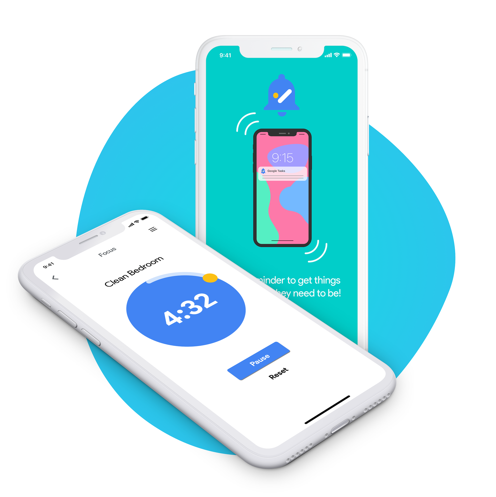
After much critique and discussion, we decided that the possible new features with the biggest impact for Julie were being able to set reminders as phone notifications, in addition to a timer for completing individual tasks in the moment- this became known as the Focus Timer.

WIREFRAMING
Creating wireframes allowed the team to decide how both of our new features could work within the layout of the existing user interface of the Google Tasks app.
This step was especially important, as we wanted to make sure that the new features would be easy for the user to find and utilize, but also not clutter or get in the way of the clean and simple aesthetic that was already there.

INFORMATION ARCHITECTURE
It was essential to make sure that our new features are not only easy to use, but also easy to find and access.
Creating a map of all the existing Google Task screens helped us make sense of the app's navigational hierarchy. Leading us to experiment with optimal placement of the new Focus Timer and notification settings.

USER JOURNEY
Circling back to our Julie Byrd persona, a detailed user journey was made to demonstrate just how the new Notification Reminders and Focus Timer could solve her moving problem.

USABILITY TESTING
Using inVision, the wireframes were adapted into a tap-through prototype to test navigation to and from our new features in addition finding just how easy they were to use.
5 participants were given several scenarios to complete with the prototype, allowing us to pinpoint any issues from a variety of perspectives.
Feedback from each test allowed us to make refinements on the fly, leading to each subsequent test result improving on the last and achieving a more optimal feature design.

DELIVERY
Extending the existing look-and-feel to our brand new features.
VISUAL LANGUAGE
After testing was completed, I designed a style guide out of the existing fonts, colors, icons, and shapes to use as a reference. This made sure that the new features and iconography would look seamless.

INTERACTION DESIGN
Aiming for quick and simple use, I designed the timer to be adjusted by either rotating the yellow dot control around the timer’s face and letting go, or in a more detailed settings menu accessible in the upper right-hand corner.

ONBOARDING
With the project wrapping up, I designed a series of onboarding screens in Adobe Illustrator to introduce our new features and ease the transition for existing users.
